
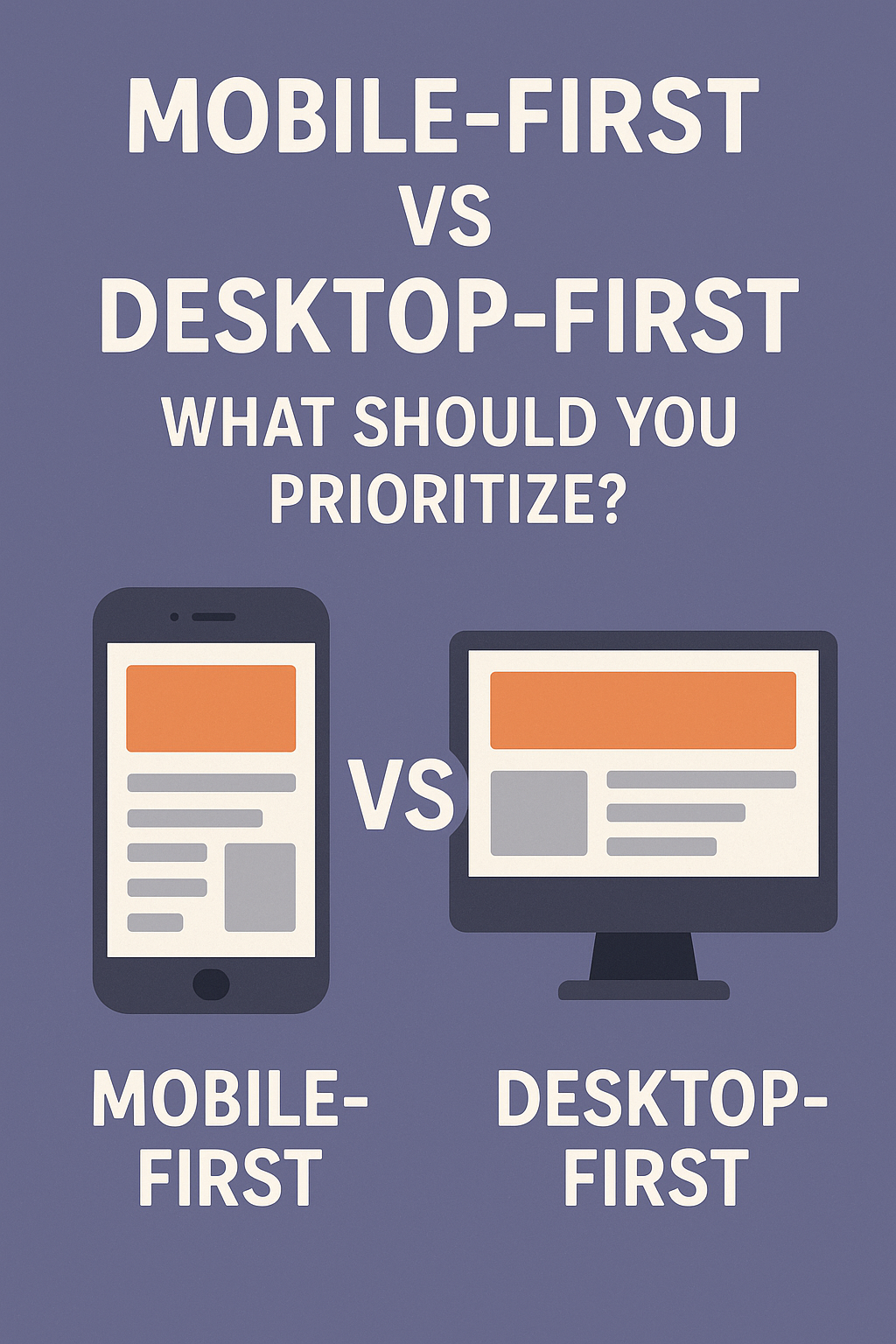
Introduction: The UX Dilemma Facing Modern Product Teams
When you’re designing a digital product today, there’s a big question you must answer early: Should you prioritize mobile-first or desktop-first?
It’s not just about screen size—it’s about context, complexity, and how your users interact with your product. With mobile traffic surging globally and desktop experiences still dominating in enterprise use, choosing the right approach can deeply impact your product’s usability and success.
Let’s break down both strategies, their pros and cons, and how to make the right call for your audience and business goals.
Defining Mobile-First and Desktop-First Design Approaches
What Is Mobile-First Design?
Mobile-first design begins with the smallest screen and builds upward. It emphasizes content hierarchy, minimalism, and performance. This method forces teams to prioritize essentials and expand features for larger displays later.
What Is Desktop-First Design?
Desktop-first starts with a full-featured experience on larger screens, typically assuming users are on high-speed internet and have access to mouse and keyboard. Mobile versions are then adapted from the original desktop design.
Key Philosophical and Technical Differences
| Aspect | Mobile-First | Desktop-First |
|---|---|---|
| Screen Size Focus | Small to large | Large to small |
| UX Priority | Simplified flow | Full-featured flow |
| Device Assumption | Touch, mobility | Mouse, keyboard |
| Development Strategy | Progressive enhancement | Graceful degradation |
The Case for Mobile-First Design
Mobile Usage Is Dominating Global Traffic
As of 2024, over 58% of global web traffic is from mobile devices. For many users, their phone is their only device.
Forces Simpler, More Focused UX
Designing for mobile pushes teams to trim the fat—fewer clicks, more clarity, and better flow.
Improves Speed and Accessibility
Mobile-first sites typically load faster and use fewer resources, benefiting all users, especially in bandwidth-constrained environments.
The Case for Desktop-First Design
Better for Complex Dashboards and Workflows
Apps like CRMs, CMS platforms, or dev tools often involve multiple columns, data tables, and drag-and-drop interactions that are hard to replicate well on mobile.
More Real Estate for Features
Desktop designs allow for simultaneous visibility of multiple interface components—perfect for productivity-focused users.
Ideal for B2B and Enterprise Applications
Many internal tools or SaaS products used in office environments still see the majority of traffic from desktops or laptops.
How to Decide: 5 Factors to Consider
1. Know Your Users and Their Devices
Where are your users located? Are they always on the move? Use analytics to identify top devices and platforms.
2. Analyze Context of Use
Is your product used in short bursts (e.g., booking a ride) or during long sessions (e.g., managing finances)? Mobile-first fits the former, desktop-first the latter.
3. Prioritize Based on Core User Tasks
Break down what your users need to accomplish. Are these tasks easily executed with one hand, or do they require precision?
4. Look at Industry Standards and Competitors
In e-commerce and social media, mobile-first is now expected. In legal tech or engineering tools, desktop is still king.
5. Factor in Team Capabilities and Timeline
Do you have designers and developers familiar with responsive or adaptive design? What can you deliver fastest without compromising UX?
Progressive Enhancement: The Best of Both Worlds?
Start Small, Add Complexity for Larger Screens
Build for the simplest case, then add layers of sophistication as screen size and capability increase.
Maintain Performance Without Sacrificing UX
This approach avoids bloated mobile versions and broken desktop experiences.
Easier Testing and Future Scalability
You get a lean foundation with scalable architecture—great for startups and growing teams.
Case Studies: How Companies Prioritized Design Approaches
Instagram: Built Mobile-First and Won Big
Instagram’s original focus was mobile-only, which made their UX seamless, fast, and addictive—perfect for photo sharing on the go.
Notion: Started Desktop-First, Then Mobile
Notion began with a powerful desktop editor. Only after nailing workflows there did they scale to mobile—smart for a productivity app.
Shopify: Balancing Admin Complexity with Mobile Needs
Shopify designed key features for mobile merchants (like order fulfillment), while keeping advanced analytics and settings on desktop.
Best Practices for Designing Across Devices
Use Responsive Design Frameworks (Tailwind, Bootstrap)
These systems help maintain layout and functionality across screen sizes with fewer custom breakpoints.
Test on Real Devices Early and Often
Simulators aren’t enough. Use physical devices to test real interactions, load times, and responsiveness.
Consider Performance, Not Just Appearance
Prioritize fast loading, touch-friendly buttons, and visible key actions—especially on mobile.
Common Pitfalls When Prioritizing One Platform
Overdesigning Mobile at the Cost of Desktop Usability
Don’t forget your desktop users—they may be fewer, but they might be more valuable (e.g., admins, power users).
Ignoring Touch UX Principles
Even on tablets, some users expect swipeable, tap-friendly interfaces. Avoid tiny click targets or hover-dependent menus.
Failing to Test Real-World Scenarios
Don’t test in a vacuum. Use your product like your users do—on commutes, coffee shops, or multi-tab desktop setups.
Conclusion: Prioritize Strategically, Not Emotionally
Choosing between mobile-first and desktop-first isn’t about trends—it’s about your users, your product, and your business goals.
Whether you prioritize one platform or embrace progressive enhancement, what matters most is designing intentionally, testing frequently, and optimizing for your users’ real lives.
FAQs on Mobile-First vs Desktop-First
1. Is mobile-first always better?
Not always. It depends on your users and the tasks they’re trying to complete.
2. What’s the main risk with desktop-first design?
You may end up with a clunky, unusable mobile experience if mobile is treated as an afterthought.
3. Can I design for both at once?
Yes, using responsive design principles and frameworks like Tailwind or Bootstrap.
4. How can I know what devices my users prefer?
Use tools like Google Analytics or Mixpanel to track device types, screen sizes, and usage patterns.
5. Should I start with a native app or mobile web?
Start with mobile web unless your product requires hardware features or offline access.
6. How do I test my design across devices?
Use real devices, responsive emulators, and services like BrowserStack or LambdaTest.
