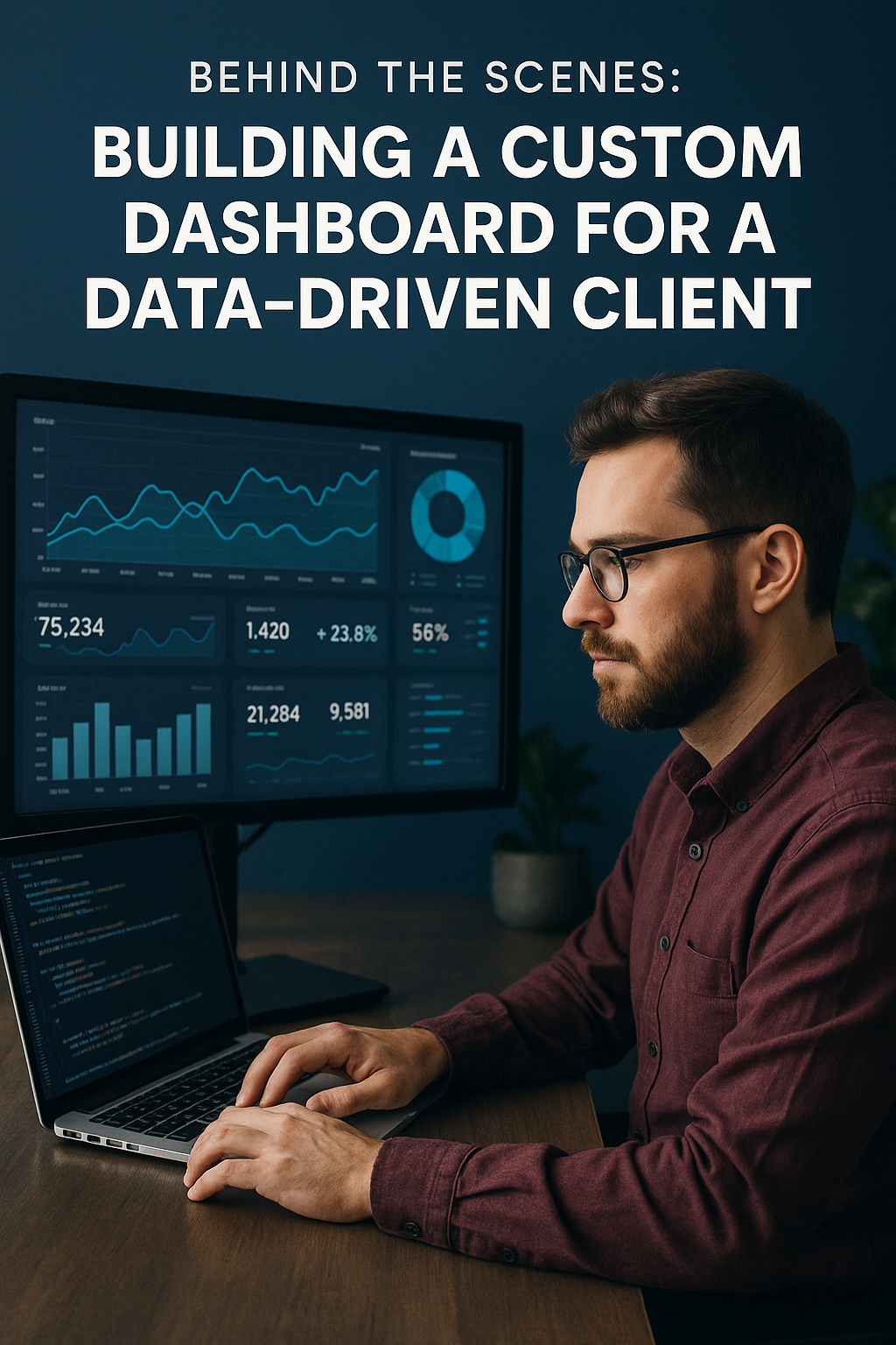
Introduction: Why Dashboards Are Mission-Critical for Modern Businesses
In a world driven by data, dashboards are no longer optional—they’re mission-critical. From startups to enterprises, companies rely on dashboards to surface insights, monitor performance, and drive smarter decisions.
But not all dashboards are created equal. A cluttered or confusing UI can bury the most important metrics. A slow-loading view can delay crucial decisions. That’s why we partnered with a fast-scaling SaaS client to build a custom dashboard experience tailored to their unique data workflows.
Here’s a behind-the-scenes look at how we planned, designed, and delivered a dashboard that truly made a difference.
The Client’s Challenge: Data Without Clarity
Understanding the Business Use Case
The client had vast amounts of operational data—but no single, unified view to interpret it. Teams were relying on spreadsheets, disconnected reports, and manual updates to make decisions.
Identifying Gaps in Existing Tools
They had tried generic BI platforms, but none fit their workflows. Key issues included:
- Complex UI that required training
- Limited real-time data support
- Inflexible permission systems
Aligning Stakeholders Around Key Metrics
We held alignment sessions to define which metrics mattered most to whom:
- C-suite wanted high-level KPIs
- Ops needed granular daily stats
- Support teams required customer health scores
Stage 1: Discovery and Requirements Gathering
Workshops with Users and Data Owners
We facilitated workshops to map out:
- Daily data needs by role
- Pain points with current tools
- Wishlists for dashboard features
Defining KPIs, Roles, and Permissions
Each user role had unique needs. We built role-based views, ensuring the CEO and support staff saw only what was relevant to them.
Data Source Mapping and System Integration Needs
Data was scattered across:
- PostgreSQL databases
- CRM systems
- Internal APIs
We mapped data flows and created a centralized integration strategy.
Stage 2: UI/UX Planning for Visual Clarity
Wireframing User Journeys for Daily Workflows
We visualized what users should see the moment they log in. Dashboards weren’t just static charts—they were actionable hubs for key workflows.
Designing for Real-Time Insights and Usability
Each chart and stat card was designed for:
- 1-second clarity
- Click-through exploration
- Mobile responsiveness
Creating a Scalable Design System
We built a custom component library with reusable UI blocks:
- KPI tiles
- Trend charts
- Filter panels
All styled for brand consistency and ease of reuse.
Stage 3: Technical Architecture and Development
Choosing the Right Stack (Laravel, Vue, Chart Libraries)
We selected:
- Laravel for back-end logic and data handling
- Vue.js for a responsive, modular frontend
- Chart.js and ApexCharts for visualizations
Building Modular, Reusable Components
We followed atomic design principles to ensure that components were easy to extend and customize across different dashboards.
Implementing Real-Time Data Syncing
Using WebSockets and Laravel Echo, we enabled live updates for key metrics, reducing the need for refreshes or manual syncing.
Stage 4: QA, Feedback Loops, and Iteration
Internal QA + Stakeholder Testing
Our QA team ran stress tests and data accuracy checks. Then, we handed the product to the client’s internal team for real-use feedback.
Adjusting Based on Live Use Feedback
From chart scaling to color contrast and tooltip delays—we refined every detail based on user interaction data.
Optimizing for Speed, Mobile, and Accessibility
We reduced initial load times to under 1.5 seconds, improved screen reader support, and ensured dashboards were tap-friendly on tablets.
Launch and Post-Launch Support
Training Teams and Creating Help Docs
We built an interactive help center and conducted live walkthroughs for each department using the dashboard.
Monitoring Usage and Error Logs
We used Sentry and Laravel Telescope to catch any errors and proactively resolve UX bugs.
Planning for Future Feature Releases
With a modular setup, we easily added:
- New metrics
- Drill-down views
- Cross-filtering capabilities
All without breaking existing functionality.
Results: Impact of the Custom Dashboard
Time Saved by Departments and Executives
- Report generation time: reduced from 4 hours to 30 seconds
- Weekly meetings now run with live data
- Executives now check metrics daily, not monthly
Better Decision-Making Through Shared Visibility
Different departments finally worked from a single source of truth, improving collaboration and reducing back-and-forth.
Adoption Metrics and Internal NPS
- 93% of staff using the dashboard weekly
- 86% reported “improved clarity”
- Internal NPS: +61 (from +18 pre-launch)
Lessons Learned from the Project
Start with the Questions, Not the Charts
It’s tempting to add pie charts everywhere. But dashboards should answer specific business questions, not just look impressive.
Design for the Lowest Common Denominator User
If your most non-technical user can’t understand the dashboard in 10 seconds, it’s too complex.
Build in Flexibility for Data and UI Changes
Data sources change. Metrics evolve. We built the dashboard so the client could add views without needing custom dev time.
Conclusion: Clarity at Scale Starts with Custom Tools
Dashboards shouldn’t just display data—they should drive decisions. By investing in a custom solution, our client gained clarity, alignment, and speed.
If your team is struggling with scattered insights, slow reporting, or unclear metrics, it might be time to explore what a custom dashboard can do for you.
FAQs on Building Custom Dashboards
1. How long did it take to build the dashboard?
We built and launched in 12 weeks, including discovery, design, development, and training.
2. What tech stack did you use?
Laravel for backend logic, Vue.js for frontend, and Chart.js + ApexCharts for data visualization.
3. Can dashboards be updated post-launch?
Absolutely—our modular setup allows easy scaling, new KPIs, and updated components.
4. What’s the biggest benefit of a custom dashboard?
Tailored UX that matches your team’s workflows and decision-making needs—something templates and off-the-shelf tools can’t provide.
5. Is real-time data syncing necessary?
Not always. But for fast-moving teams or high-frequency decisions, it adds massive value.
6. Can we integrate with our current tools (e.g., Salesforce, Google Sheets)?
Yes. We built custom APIs and data bridges to pull in live data from third-party tools.

